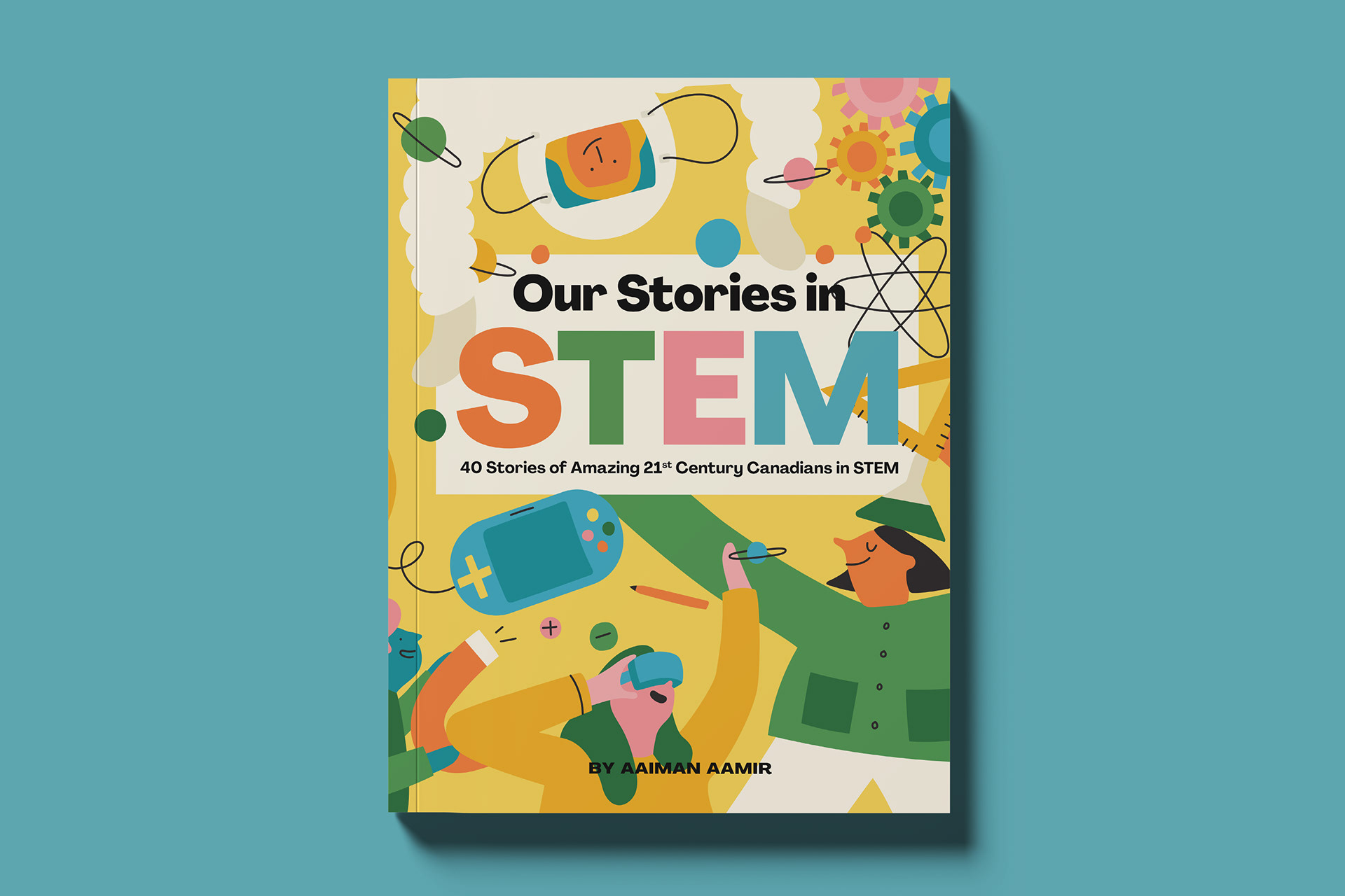
The Brief: Design a comprehensive, text-heavy children's non-fiction anthology layout that seamlessly integrates complex science topics with diverse artwork from multiple Canadian women illustrators.
The Problem: With a massive, encyclopedic manuscript and a wide variety of completely different artistic styles from multiple contributing illustrators, the book risked looking messy, disconnected, and visually exhausting for young readers. The challenge was to invent a master layout grid that was flexible enough to house heavy blocks of technical text and diverse art styles, while unifying the entire book into a cohesive, singular product line.
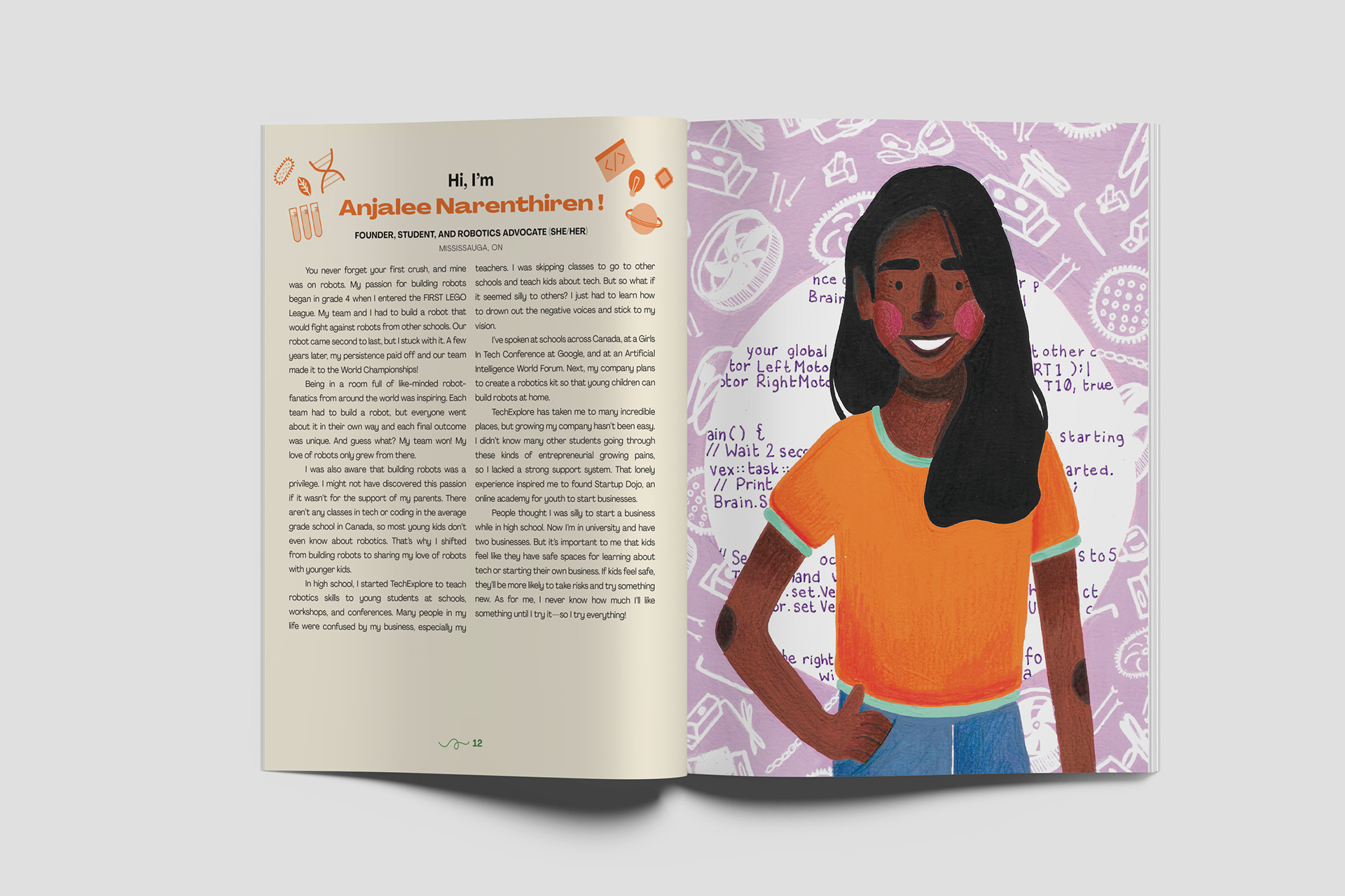
The Solution: I established a highly structured, modern typographic grid featuring consistent, clean running headers, colour-coded sidebars, and bold pull-quotes to anchor the text. I then designed custom framing elements and neutral, adaptive background spaces that acted as a visual "buffer" between the diverse illustrations. This strategic framing allowed each artist's unique style to shine on their respective pages without clashing with the overall look of the book.
The Impact:While the project was ultimately shelved prior to commercial publication by the organization, it stands as a massive structural triumph. The completed, publication-ready production blueprint flawlessly demonstrates my ability to handle large-scale document management, complex multi-page text formatting, and high-level collaborative art direction.
• • •
• • •
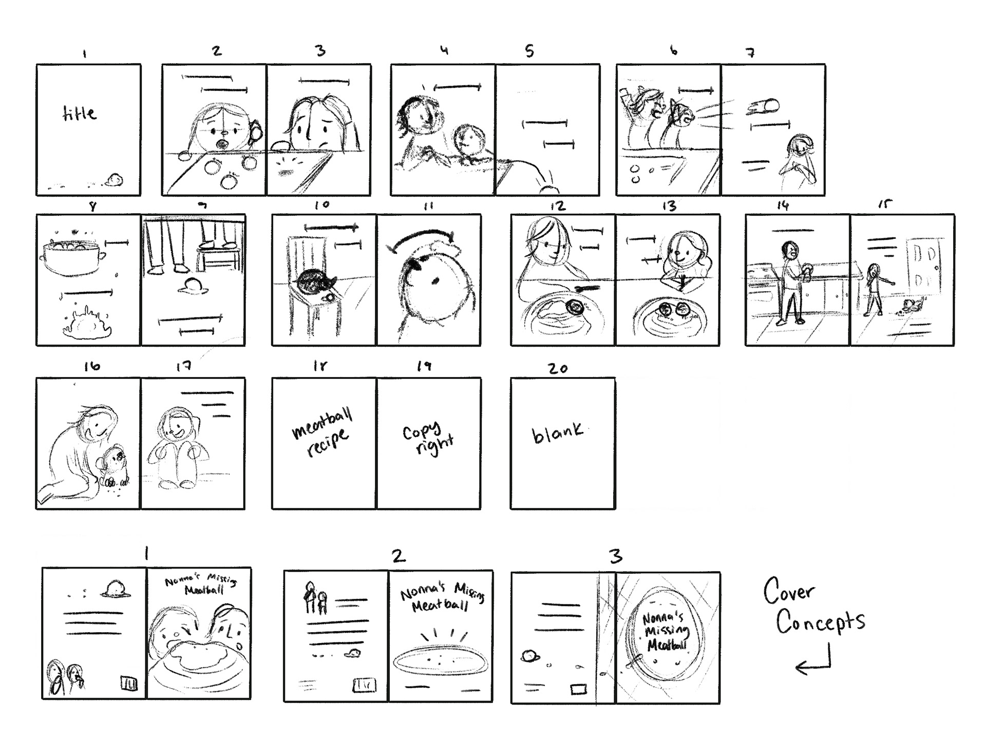
THE PROCESS