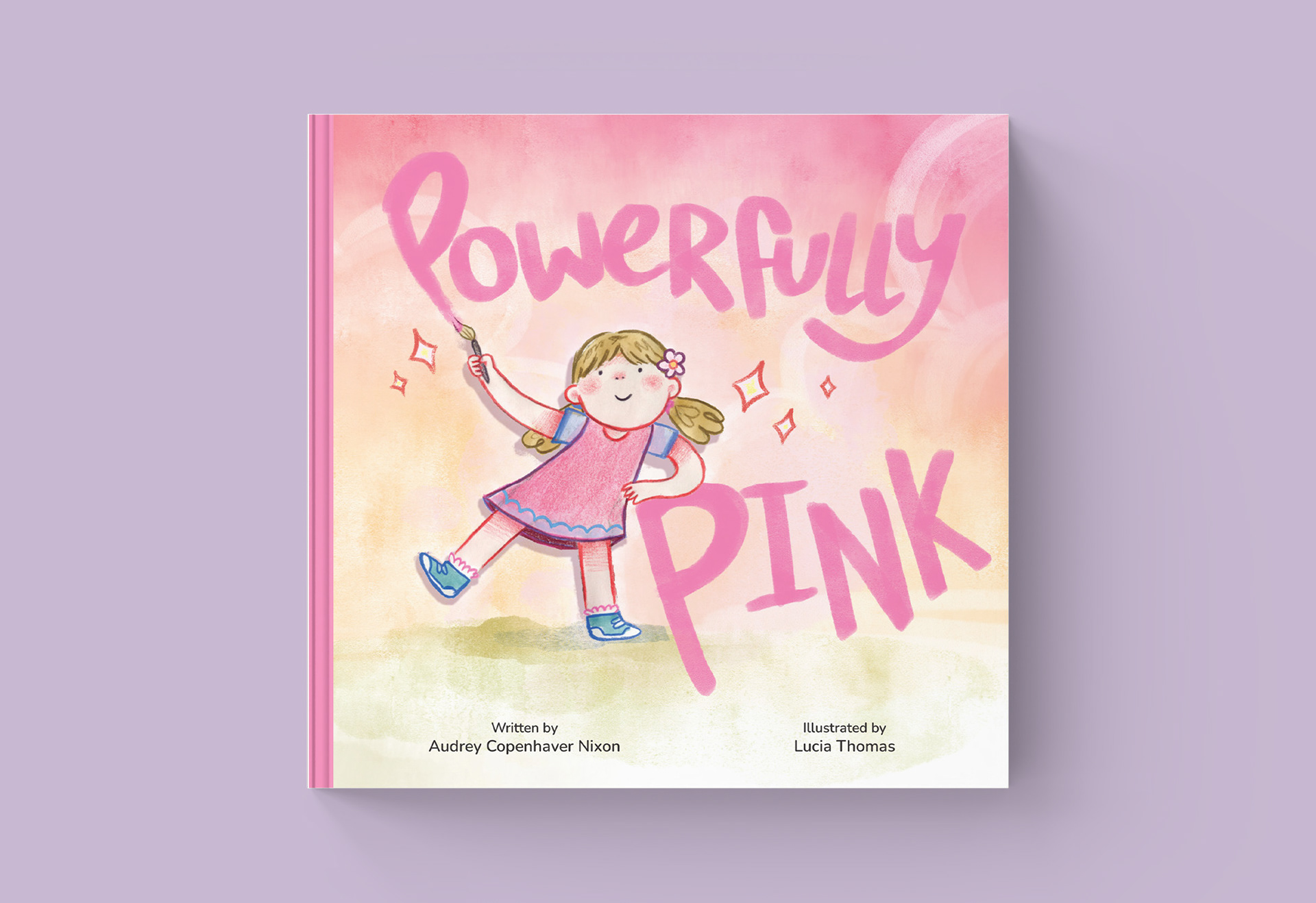
The Brief: Provide custom typography and layout design for a completed children’s picture book manuscript where the illustrations were already finalized.
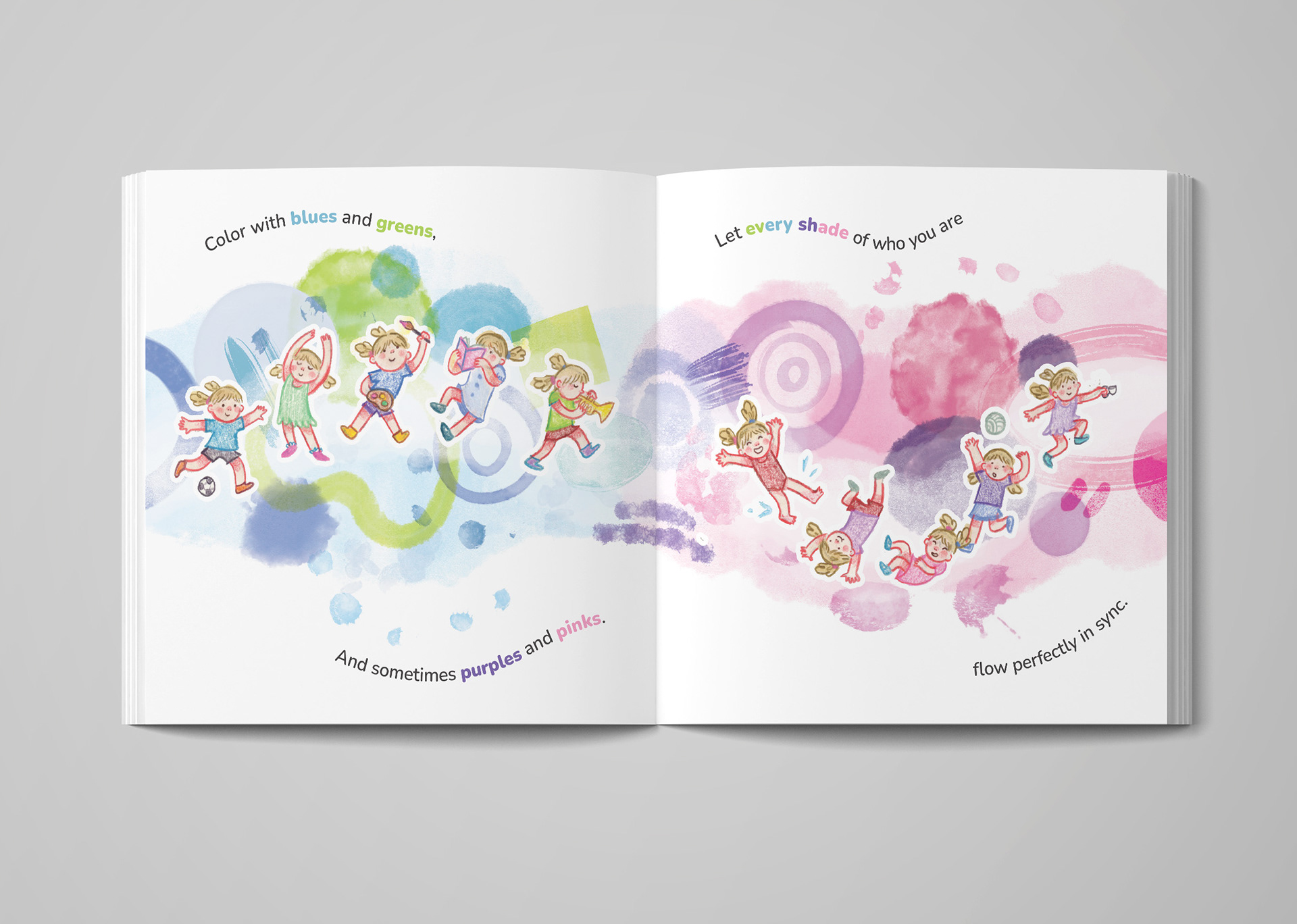
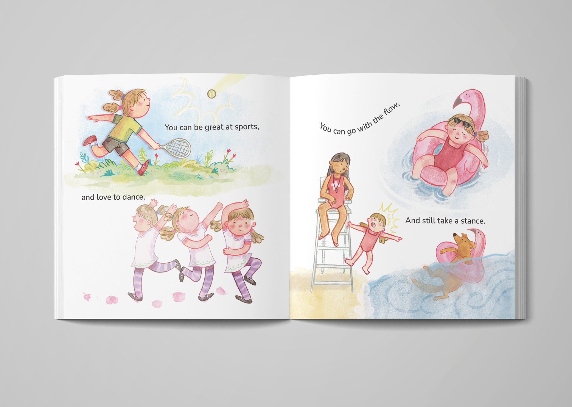
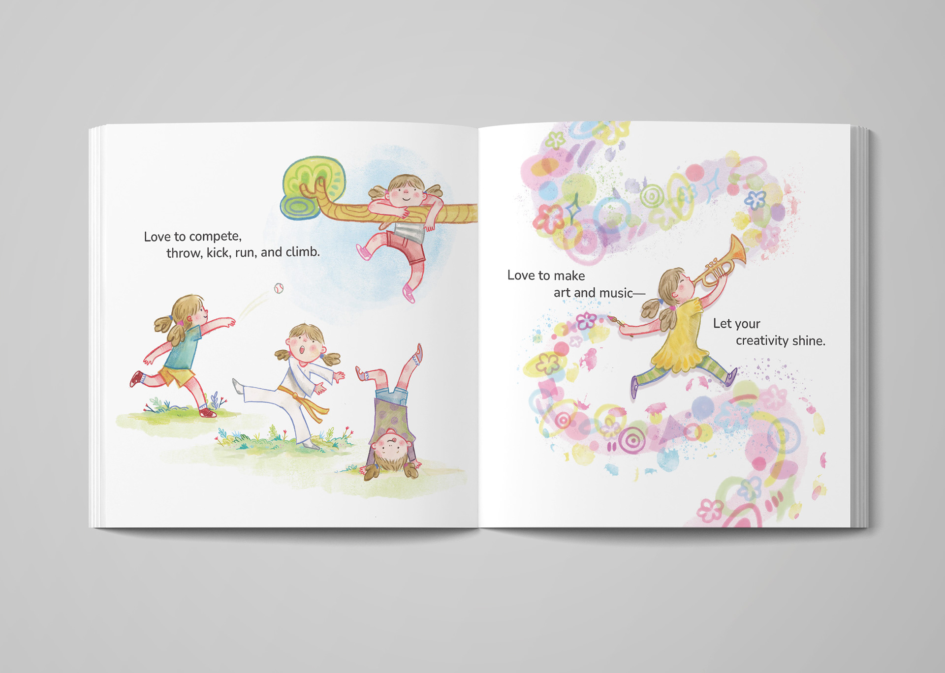
The Problem: The author had beautiful, completed illustrations but faced a major hurdle: the text needed to be integrated smoothly into pages that hadn't been originally planned with a strict typographic grid. The text needed to remain highly legible for early readers without obscuring the artwork, blocking important illustration details, or making the pages feel chaotic and overcrowded.
The Solution: I meticulously audited each illustration to find the natural "negative space" zones where text could live organically. Rather than just dropping standard text blocks onto the art, I carefully formatted and wrapped the typography to complement the flow of the illustrations. I selected a clean, friendly, and highly legible typeface, adjusting font weights and utilizing subtle background tints where necessary to guarantee flawless contrast and easy reading against complex painted backgrounds.
The Impact:The collaboration transformed independent illustrations into a beautifully structured storybook. The author received print-ready, professionally typeset files that perfectly balanced the art and text, creating an inviting and accessible reading experience for young children.
• • •