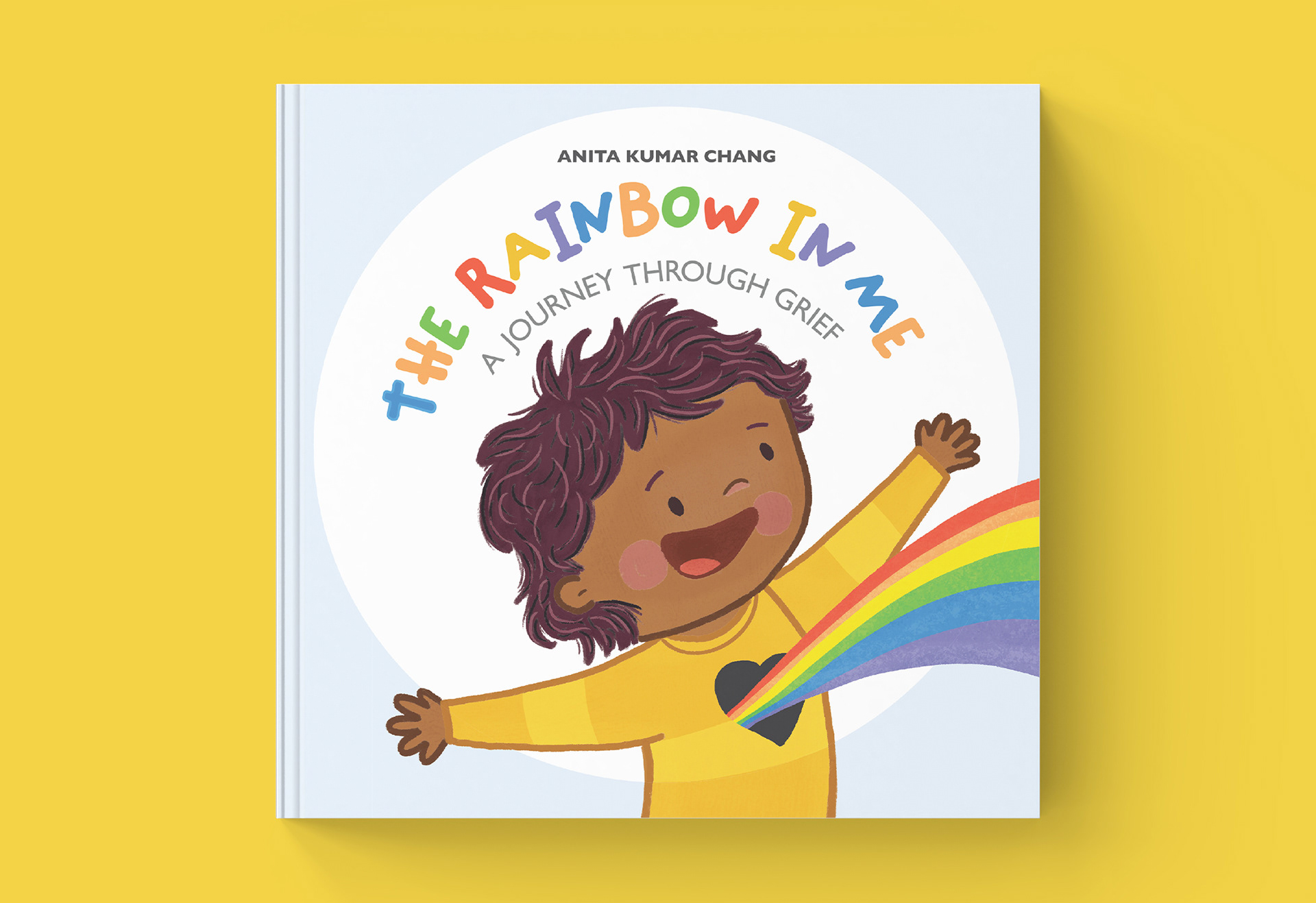
The Brief: Illustrate a children’s picture book written by Anita Kumar Chang that takes young readers through the stages of grief using a rainbow as an analogy.
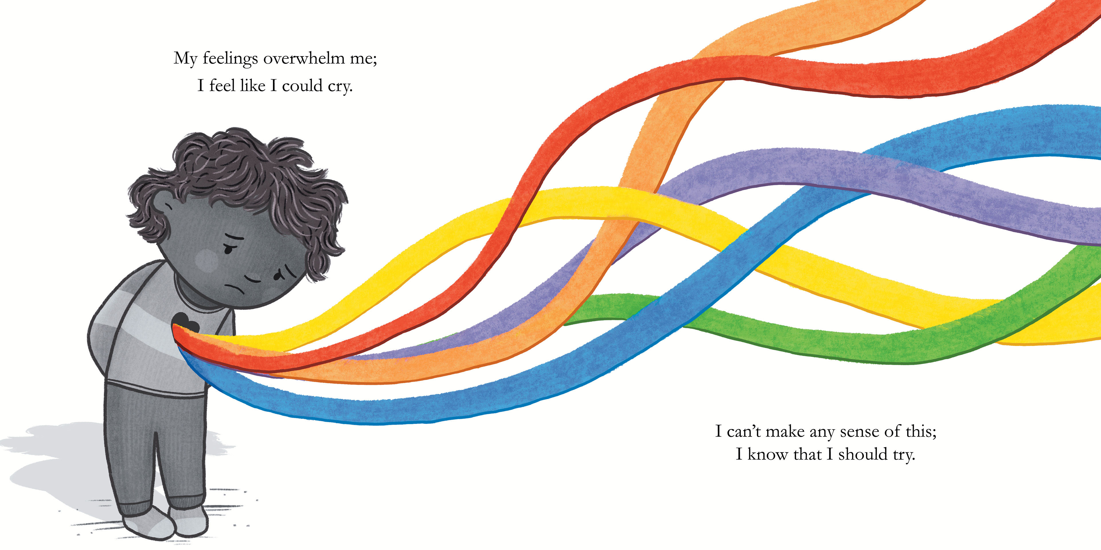
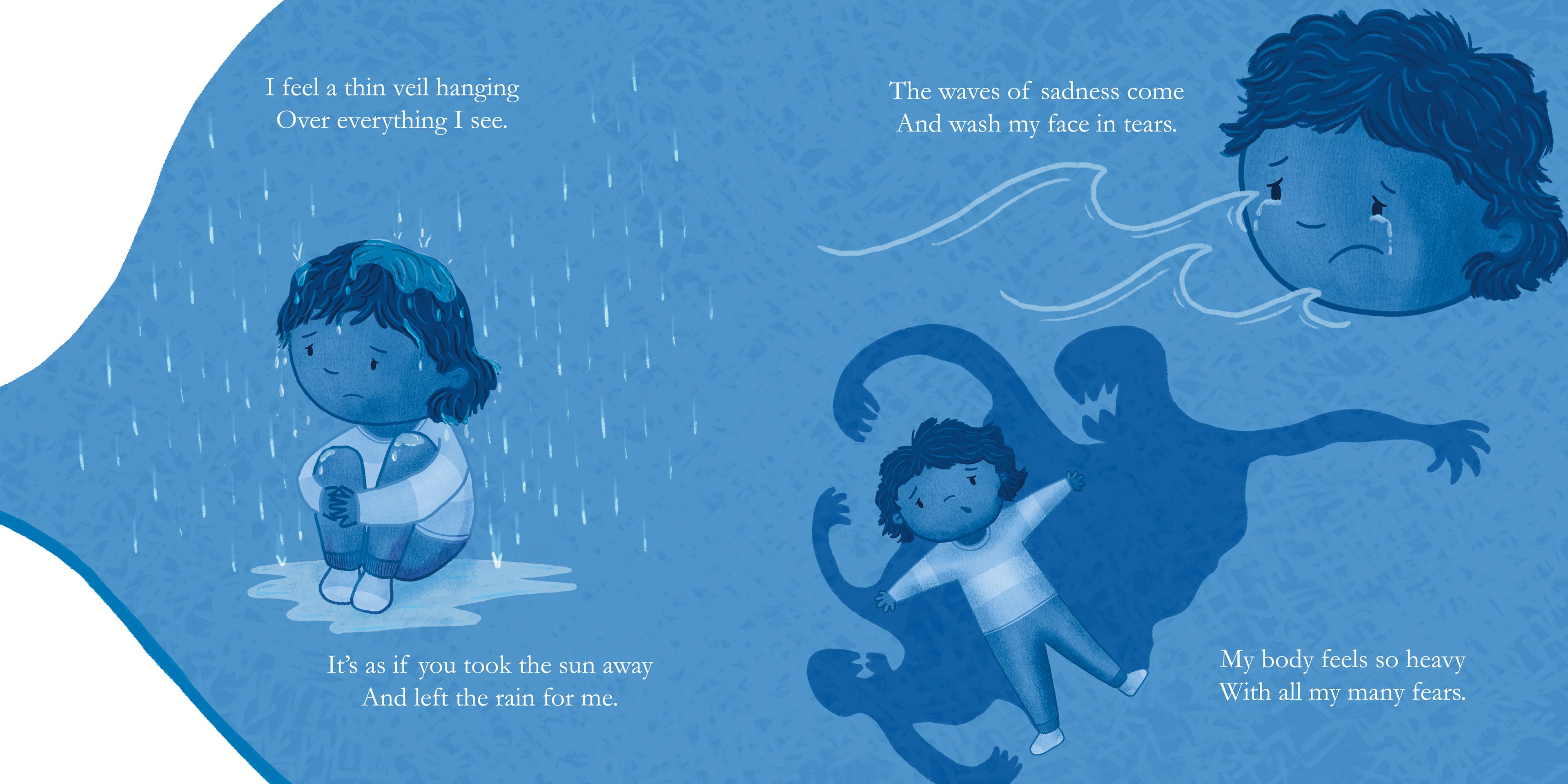
The Problem: Grief is an incredibly heavy topic for a children's book. The author knew she wanted a strict structure—focusing on a single, specific color per page to match the rainbow theme—but wasn't sure how to execute it without the book feeling visually overwhelming. The hurdle was to make the artwork soft and comforting, while maintaining its clinical utility as a therapeutic resource for parents, educators, and child therapists.
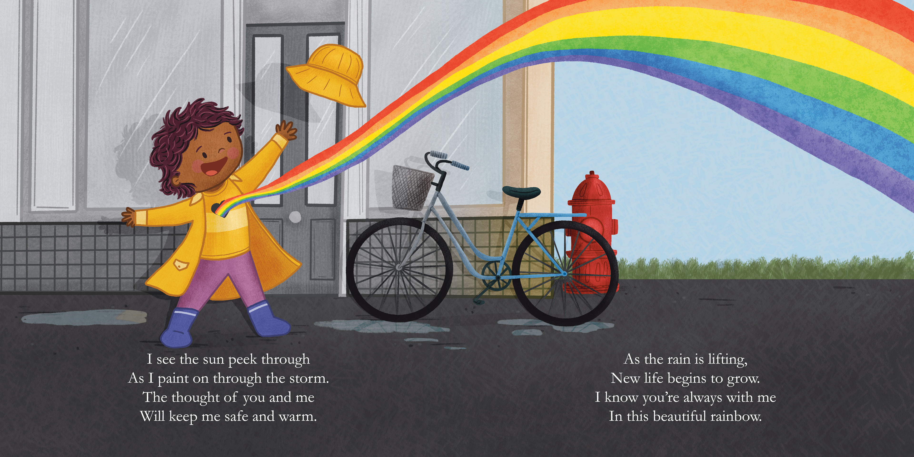
The Solution: I embraced the "colour-per-page" constraint by utilizing monochromatic gradients and soft, atmospheric textures that captured the specific emotional weight of each stage of grief. By using gentle lighting and thoughtful character interactions, I kept the tone deeply comforting. I carefully designed the layouts to leave spacious, calming areas for the text, allowing the therapeutic messages to sit in a peaceful, non-threatening visual environment.
The Impact:The project resulted in a deeply moving, highly professional therapeutic tool that beautifully bridges the gap between clinical resource and gentle bedtime story, providing a vital visual language for families navigating loss together.
• • •